Finally got around to posting my first full digital painting tutorial on this blog, hope you’ll find it helpful!
BRUSH SET (.ABR) | WORKING FILE (.PSD)
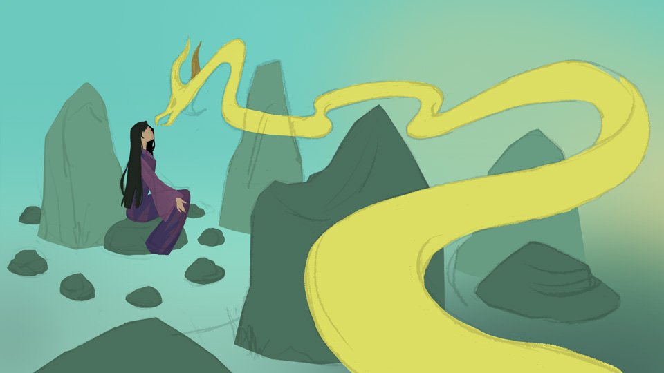
Step 1: Loose Compositional Sketch
Thumbnailing is probably the most crucial step to creating a quality finished illustration, so don't skimp on the blueprint stage! During this step, I try to devise a compelling concept and composition. In this composition, the entire body of the dragon serves as a guide for the viewer's eye movement—starting from the foreground and meandering between the rocks before ending at the character / focal point. A carefully thought-out composition will make your illustration easy to read while reinforcing the story.
The story behind this image is that a blind but determined girl has summoned a mighty, all-seeing dragon who lends her its eyes, but for a hefty price. It’s a personal story that I’ve been working on in some form or another for a while!
I keep my sketches very loose and representational, focusing on the composition and design
Tip: Use Guides to Improve Your Composition
This is one of the oldest tricks in the book, yet many artists forget to utilize compositional guides in their work. These are especially helpful if you’re stuck wrestling with a boring or busy composition! If I feel something is off about my composition, I'll often overlay a Rule of Thirds or Golden Spiral guide over the image and adjust elements to match the guide. (Note: Click the links to download the aforementioned guides.)
Blocking out the composition using the “rule of thirds”
Step 2: Color Blocking
This is the step where I can more or less predict if my illustration is going to come together since I've already put plenty of thought into the overall color design of the piece during the planning phase. I decided to make the dominant colors in this illustration teal and yellow - a basic analogous color scheme that's easy on the eyes.
Thoughtful color design can be used to draw the viewer's eye and simplify an illustration. Keeping things simple is key!
teal and yellow: a simple analogous color scheme
Step 3: Block in Light/Shadows to Establish a Light Source
Lighting and color can be used to great effect in any illustration to add atmosphere, establish focal points, and improve readability. For this piece, I went with a direct light source from the top-right (painted with a light yellow on “overlay” mode), which allowed me to create interesting high-contrast shapes where the sunlight hits. Taking special care to stylize your light/shadow shapes will give your piece a lovely sense of dimension and contrast.
One of my favorite examples of high-contrast, stylized lighting design is the opening credits of Kung Fu Panda, which I’ve found myself rewatching time and time again for inspiration.

Painting in the light source immediately adds a sense of dimension to the piece
Step 4: Textures & Details
Now it’s time to fine-tune your illustration with textures and details. I added a hand-painted scale pattern on the foreground portion of the dragon’s body, which helped give the body a sense of scale, direction, and realism. Next, I painted a bunch more foliage all over the piece, which also served to balance out the composition. I started painting in some ground cover and foliage with the tree on the left and also blocked in a simple mountainous background.

Adding details, textures, and scales on the dragon

Note how the plant on the lower right and the tree in the top left help balance out the composition
Step 5: Apply High-Contrast Lighting
I find this step to be the most fun - it’s so satisfying to light up your illustration! The key is not to go overboard with applying those little sparks of light since it can get pretty addicting! In a previous version of this piece, nearly all of the leaves were glowing, in a pretty but dumb way that made no sense. I eventually settled on applying the most high-contrast highlights on the dragon itself, since it makes sense that a giant golden dragon would glint in the sunlight.
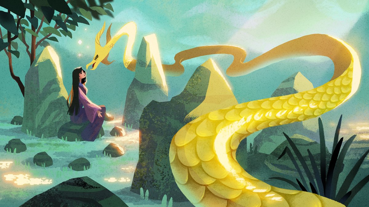
The final illustration!
If you’ve found this tutorial helpful in some way, please let me know and I’ll try to make more in the future! Thank you for reading, and happy painting!